
This blog was originally published on the EPCC website.
EPCC and the Software Sustainability Institute have been joined by Meruyert Shayakhmetova, a volunteer from the Access Data programme, who has made a big impact on a public engagement project to visualise historical air pollution data. Here we find out more about her reasons for volunteering and what the work has involved.
Meruyert Shayakhmetova has over a decade's experience of working in data and IT in her native Kazakhstan. She recently moved to the UK and is working to further her career here in Scotland.
After completing one of Access to Industry's Access Data courses delivered by Edinburgh College and funded by the Data-Driven Innovation initiative, Meruyert wanted to find voluntary work where she could contribute to the local community. The "Access Data" programme matched Meruyert to a voluntary project at EPCC in which she has been visualising air pollution data in novel ways.
"We are so grateful to Meruyert for bringing this data to life!" Jim McQuaid, University of Leeds |
We asked Meruyert what drew her to the air pollution project
She explained that, like many of us, she is worried about climate change and air pollution. Meruyert grew up in a mining town in Kazakhstan, where pollution from local industries regularly turned the snow black. In addition, for anyone with an interest in data science, EPCC is a great place to gain experience.
“I remember as a child I used to wipe black dust from the window sills, and in winter, the snow sometimes would be black.” Meruyert Shayakhmetova |
What did the work involve?
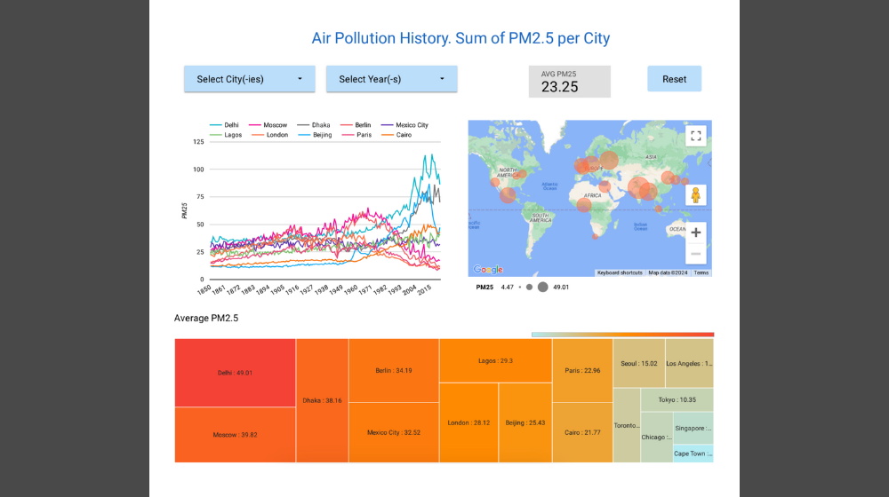
In the project Meruyert worked with a large dataset of historical particulate matter (PM2.5) concentrations in 183 cities across the globe. First she transformed the dataset using Microsoft Power Query and created a summary table. Then she built an interactive dashboard using Google Looker Studio tool. The dashboard includes a line chart showing pollution growth dynamics with city-to-city comparisons, a bubble map displaying average city pollution levels, and a heatmap ranging from less polluted to highly polluted cities. She added slicers for city and period selection.
The most challenging aspect was fitting the visualisations for air quality indicators onto a single page (there are 200 years of data for each city!). To address this, she tested various options and ultimately added filters and compactly placed multiple visualisation options on the dashboard.
Meruyert also researched historical air pollution facts, which will be presented alongside the new visualisations when the project launches to the public.
“Thanks to this placement, I gained my first work experience in a local company. It reinforced my belief that my knowledge and skills can benefit society, especially in addressing global environmental challenges.” Meruyert Shayakhmetova |
Meruyert presented her findings to Software Sustainability Institute staff, who were impressed by how much she had achieved. EPCC provided support for the project, offering guidance and expertise that enabled Meruyert to effectively transform and visualise the extensive air pollution dataset.
"Meruyert has made a huge contribution to the project, quickly visualising the data in an interactive dashboard using Google Looker Studio." Kirsty PringleSoftware Sustainability Institute & EPCC |
Links