
Tufte and the art and science of effective data visualisation
 By Larisa Blazic, Senior Lecturer - Faculty of Media, Arts and Design - University of Westminster.
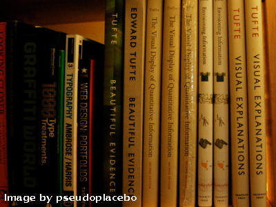
Data visualisation, information design, infographics are forms of visual communication of data to educate, inform thus contributing to scientific discovery. A combination of basic graphics design elements, statistics and cognitive science, it functions as a translation of complex data sets into accessible, coherent and comprehensive narratives. In order to unpack how and why is this useful for scientific research and it's dissemination, it is probably best to start with Edward Tufte, an American statistician and artist, and Professor Emeritus of Political Science, Statistics, and Computer Science at Yale University. Long before big data craze, in the late 20th century, he wrote, designed, and self-published The Visual Display of Quantitative Information and the two companion volumes Envisioning Information and Visual Explanations set to explain the fundamental principles of information displays, how to display data for precise, effective, quick analysis and how to communicate complex material by visual means.
.svg)
Charles Minard's 1869 chart showing the number of men in Napoleon’s 1812 Russian campaign army, their movements, as well as the temperature they encountered on the return path. Lithograph, 62 x 30 cm Source: Wikimedia commons; https://en.wikipedia.org/wiki/File:Minard.png
An essential reading for anybody aiming to visualise datasets, Tufte's first book, concepts lie factor, the data-ink ratio, and the data density of a graphic are useful guides when dealing with visual representation of information. Lie factor, the representation of numbers, as physically measured on the surface of the graphic itself, should be directly proportional to the quantities represented (Tufte, 1991). In the context of visualising scientific data seems obvious advice but a very good reminder how easy it is to visually misinterpret data if forgetting proportion and scale in translation. Data-ink ratio calls for “less is more” attitude and argues against putting editorial agendas of style as decoration ahead of data measures. Above all else show the data, says Tufte. Lastly, data density is the ratio of the number of data values displayed to the total area of the graph which as all above can have “make or break” influence on readability of the data and as such is a useful check when planning visualisation.
In Chapter 1 of The Visual Display of Quantitative Information, Tufte discusses Graphical Excellence. He opens with the following list of what graphical displays should do:
- show the data
- induce the viewer to think about the substance, rather than about methodology, graphic design, the technology of graphic productions, or something else
- avoid distorting what the data have to say
- present many numbers in a small space
- make large data sets coherent
- encourage the eye to compare different pieces of data
- reveal the data at several levels of detail
- serve a reasonably clear purpose: description, exploration, tabulation, or decoration
- be closely integrated with the statistical and verbal descriptions of a data set.
Pie charts, maps, hierarchies, tree-maps, networks, plots, bar charts, histograms, Gantt charts, heat maps, scatter plots, to name a few of diagram types used in contemporary scientific data visualisations, all rely on balance, proportion, relevant scale, choice of colour and type, geometry and relationships of visual elements: grids, etc. Thus making scientist-designer alliance inevitable.
Drawing from above, to achieve optimum readability and “graphical excellence” supporting scientific discovery would imply a team work. In a world of multi-skilling and ever increasing complexities of computer driven data generation, perhaps it unreasonable to expect scientists to be experts in visual literacy and graphic communication/information visualisation designers to be experts of any given scientific discipline they are visualising. Later in his book Tufte is critical of professional designers' lack of quantitative skills and since 1983 when it was written, much has changed. However, with timely inclusion of graphic designers, early in the data gathering and analysis process, this can be avoided. An early constitution of cross-disciplinary teams, enabling a conversation between designers and scientists, would result in more effective and informed design choices. In the process designers would gain insight in the “material” they are working with and scientists would gain insights into visual language suitable for the data they are working with.
Thorough examination of graphical practice and theory of data graphics in Visual display of Quantitative Information makes Tufte's work an invaluable starting point of education on examination of data, conceptualisation and eventual visualisation all in the name of clear, precise and effective communication of findings. Graphical competence, according to Tufte, demands three quite different skills: the substantive, statistical and artistic. All three, when employed appropriately, can contribute greatly to scientific research and it's dissemination in it's revelation of complexity and make even stronger argument for collaboration between scientists and designers.
Although this post was set out to expand on data visualisation top tips, it arrived at the point of reflecting on the role a designer could have in a world of scientific data visualisation and advocating design inclusive research teams. This is probably connected to scientists' perception of design work as beautification work, something that comes at the end of long, rigorous, fully considered process. As in many other fields in contemporary production of knowledge, cross disciplinary way of working seems really exciting and show more promise of better results.
For more on visualisations and research, see Miriah Meyer's wonderful TEDx talk on Information Visualization for Scientific Discovery!