
Brand guidelines
Software Sustainability Institute Brand Guidelines
These are the brand guidelines of the Software Sustainability Institute (SSI). They explain what the SSI stands for and how to express that visually and verbally.
The following were designed to help you present a consistent, coherent and clear image that will support and enhance the status of the Institute.
Please use the toolkit when you are commissioning, designing or delivering any kind of communications for the SSI.
View the SSI Guidelines on how to cite us, including slide templates here.
Download the SSI logos here.
Key Message
The Software Sustainability Institute is a national facility for building better software. We help researchers to introduce software into their research or improve the software they already use. The Institute’s vision is to create a world where software is treated as a first-class citizen and is sustainable, enabling better research.
Our strapline reads “Better Software, Better Research.”
Values
The Institute has a position of national responsibility, so we conduct our work professionally. However, we present a friendly, informal persona, which appeals and makes us approachable to our target audiences and distances us from competitors who have adhered to conventional academic practices.
We believe that community-based solutions are effective and cost-efficient, so we promote collaboration within the research community.
We are highly innovative and are keen to use new approaches in all aspects of our work.
We believe that content is king. Badly written content litters the internet, and we do not want to contribute towards it. All content that is published under the Institute’s brand will be reviewed and edited to conform to a quality standard.
Palette
Iconic signature colours associated with the brand's identity
.png) | The Signature Colour |
To be used only as an accent colour, usually as part of the logo. It should never be used as a background colour. | |
%20-%20Copy.png) | The Secondary Colour |
| To be used only as a secondary accent colour, to make the visuals more engaging. It is red's complementary colour. It should never be used as a background colour. |
Muted and professional-looking colours used as the backdrop of all SSI activities
%20-%20Copy.png) | The Main Colours |
| To be used as the predominant colours in all visual elements either for the background or text in the case of charcoal. | |
.png) | The Necessary Colours |
| To be used when necessary for text (white on a dark background and black on a light background as an alternative to charcoal). |
Primary Logo | |
|---|---|
 | The primary logo is the main visual representation of our brand and should be used whenever possible. The red version is the principal one, while the black and white versions should be used to contrast different background colours. When resizing the logo, it should maintain its original proportions to ensure legibility and consistency. |
Submark Logo | |
| The submark logo is a condensed version of our primary logo and is used in situations where the full logo may not fit or is too busy. The red version is the principal one, while the black and white versions should be used to contrast different background colours. When resizing the logo, it should maintain its original proportions to ensure legibility and consistency. | |
Icon Logo | |
| The icon logo is a graphical representation of our brand and consists of a simple, recognisable symbol that reflects our brand's identity. This logo is not a substitute for the primary and submark logos and should only be used as a favicon or social media profile picture. The red version is the principal one, while the black and white versions should be used to contrast different background colours. When resizing the logo, it should maintain its original proportions to ensure legibility and consistency | |
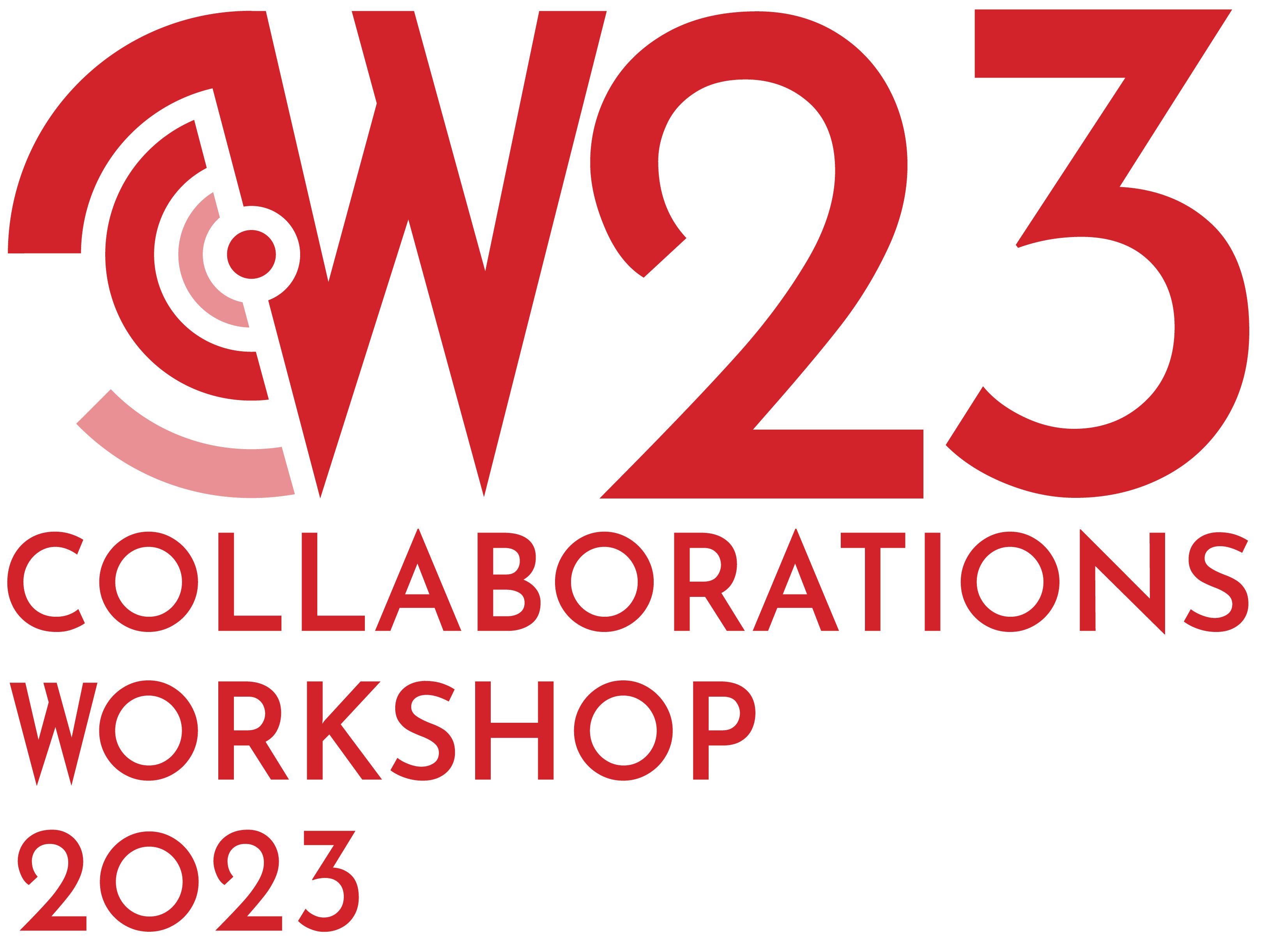
CW23 Primary Logo | |
| The CW23 primary logo is the main visual representation of the Collaborations Workshop and should be used whenever possible. The red version is the principal one, while the black and white versions should be used to contrast different background colours. When resizing the logo, it should maintain its original proportions to ensure legibility and consistency. The logo will be updated to reflect the change of year. | |
CW23 Stacked Logo | |
 | The stacked logo is a variation of the CW23 primary logo that is arranged vertically. The stacked logo should only be used in situations where the horizontal primary logo is not practical. The red version is the principal one, while the black and white versions should be used to contrast different background colours. When resizing the logo, it should maintain its original proportions to ensure legibility and consistency. The logo will be updated to reflect the change of year. |
RSC Primary Logo | |
| The RSC primary logo is the main visual representation of the Research Software Camp and should be used whenever possible. The red version is the principal one, while the black and white versions should be used to contrast different background colours. When resizing the logo, it should maintain its original proportions to ensure legibility and consistency. | |
RSC Stacked Logo | |
| The stacked logo is a variation of the RSC primary logo that is arranged vertically. The stacked logo should only be used in situations where the horizontal primary logo is not practical. The red version is the principal one, while the black and white versions should be used to contrast different background colours. When resizing the logo, it should maintain its original proportions to ensure legibility and consistency. | |
Logo Guidance
Colour
Please do not change the SSI logos or alter them in anyway. Always use the files provided. Always use the red coloured logo whenever possible. Use the black or white versions whenever red cannot be used.
.png)
Exclusion Zone
To preserve the clarity and legibility of the SSI logos, the height of the text should be used as illustrated to create a safe area. No other text or images should enter this space. This ensures that the logo has clarity and legibility.
%20-%20Copy.png)
Integrity
Modifying and editing the logo in any way undermines its impact and the professionalism of the SSI producing communications that won’t represent the brand correctly. Do not tilt, apply effects, alter proportions, alter the typeface, alter the hierarchy, or place on low contrasting backgrounds.
%20-%20Copy.png)
Editorial style guide
Refer to our A to Z: Editorial Style Guide to ensure copy written for the Institute brand is consistent across our online and printed platforms.
Citing the Institute’s work
If you have worked with us, we’d appreciate it if you would acknowledge the support and assistance you’ve received. This helps our funders to see the work we have done with all our partners and collaborators. Read our guidance on how to cite us.
Funding
We are funded by the seven councils that form UKRI. In official documents and outreach materials, the following acknowledgement should be included:
The Software Sustainability Institute is supported by the UK’s seven Research Councils through Grant EP/H043160/1, Grant EP/N006410/1 and Grant EP/S021779/1.
Any questions about our brand guidelines should be directed to the Communications team at info@software.ac.uk