Efficient and beautiful data visualisation: the finessing steps
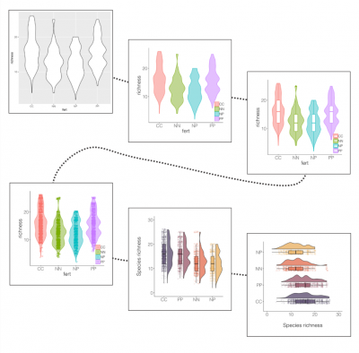 Image by Gergana Daskalova
By Software Sustainability Institute Fellow Gergana Daskalova.
Figures are a powerful way to tell a story with data. When artfully made, a figure can set the scene, like the first pages of a book, grab your attention and lure you in to find out more. It can surprise you or confirm what you’ve suspected all along, and finally, leave you with a new piece of knowledge.
Making good figures great
Fitting that whole journey into a figure doesn’t happen straight away - these days with lots of useful data visualisation coding packages around, it’s not hard to make a good figure. Making a great figure, however, takes practice and thought. And sometimes despite your best code efficiency efforts, the length of the code might indeed start to approach that of a short novel. Though it can be intuitive to recognise a great figure when you see one, finessing one of your own isn’t always as simple. That’s why I was keen to lead a workshop not just on making good figures, but on how to take them a step further.
As part of my Fellowship at the Software Sustainability Institute, one of my goals is to collaborate with different institutions to share efficient and reproducible coding workflows. Organising a coding workshop at the University of Colorado Boulder in the USA fit right into that theme. At the start of the year, when international travel was still possible, I visited Boulder and organised a workshop on efficient and beautiful data visualisation, or as I like calling it, figure beautification. The workshop brought together ecologists and evolutionary biologists, but the theme really spans across disciplines and the tips and advice given throughout the tutorial can be useful to many.
Data visualisation workshop
The workshop took us through the figure beautification journey and how to clearly communicate scientific messages with figures, with some useful tips for data manipulation and synthesis along the way. It was great to see so many enthusiastic learners engage with data visualisation and share tips and thoughts on figures. I certainly have learned a lot from looking at other people’s figures, checking out the portfolios of professional data visualisation artists and also browsing through Twitter. Sometimes there is a great way to visually share your scientific story, but it’s just not obvious at first. The more often you go through the figure beautification process, the easier it becomes to see the way.
In the workshop, we went through three different examples, showing a variety of directions in which you could take your graphs. And now that the new Coding Club online course is live, with its tailored Wiz of Data Viz selection of tutorials, you can keep the journey going and do more tutorials to go even further with data visualisation!
The workshop materials are freely available as an online tutorial on the Coding Club website.