
Research Data Visualisation Workshop Report
 By Raniere Silva, Community Officer, Olivia Guest, University of Oxford, Vincent Knight,Cardiff University, Christina Bergmann, Ecole Normale Supérieure.
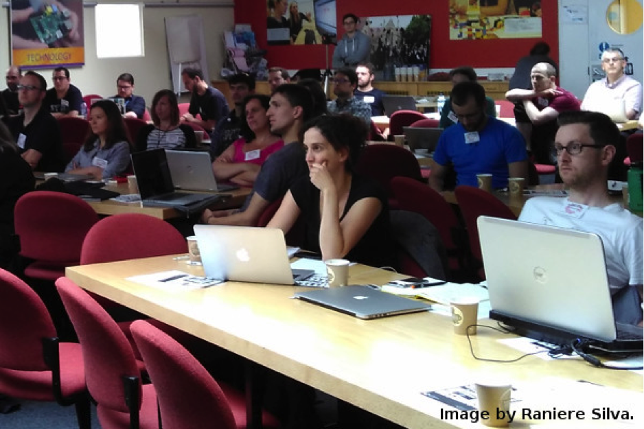
The Institute’s Research Data Visualisation Workshop took place on the 28th of July 2016 at the University of Manchester. Raniere Silva’s warm welcome was followed by Prof. Jessie Kennedy’s, from the Institute for Informatics and Digital Innovation at Edinburgh Napier University, keynote talk. Jessie spoke about the miscommunication of data due to poor visualisation techniques and how to avoid it. With over 50 attendees, the workshop provided an environment for learning and sharing. In the following sections, we will cover the events that took place during the workshop.
The Keynote
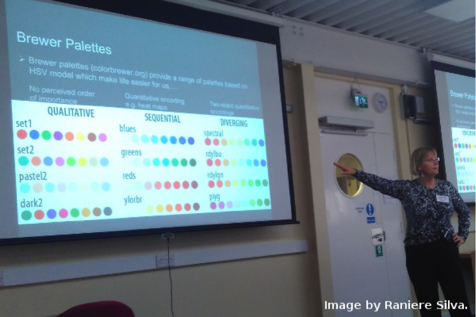
The Research Data Visualisation keynote talk was titled: ‘Design Principles in Information Visualisation’, which was expertly delivered by Prof Jessie Kennedy. Jessie gave a tour of the mistakes that researchers make in their visualisations. Such mistakes can result in miscommunicating the story that the data is telling, either when exploring the data to get a better idea of it or when communicating data and results. In her talk, she highlighted the (mis)use of colour and recommended researchers to use the Brewer colour palettes when choosing the colour for their visualisations to avoid problems, for example, when a single color dominates or colors are difficult to distinguish. Shape, size, proximity, and connectedness further influence the perceptual grouping of data.
Professor Kennedy also provided examples of interactive techniques, many of them implemented using the tools listed at BiVi Community Site, which allow viewers to explore various aspects of data and are designed to highlight important aspects and relationships. Finally, she reminded the attendees to keep visualisations clear and concise and that it is important to ask yourself: will viewers remember the visualisation or the intended message?
Talks
After Jessie's keynote, we had talks from Dr Martin Chorley, Dr Christina Bergmann, and Dr Andy South on visualisations in human sciences, biology, and geographic information systems, respectively.
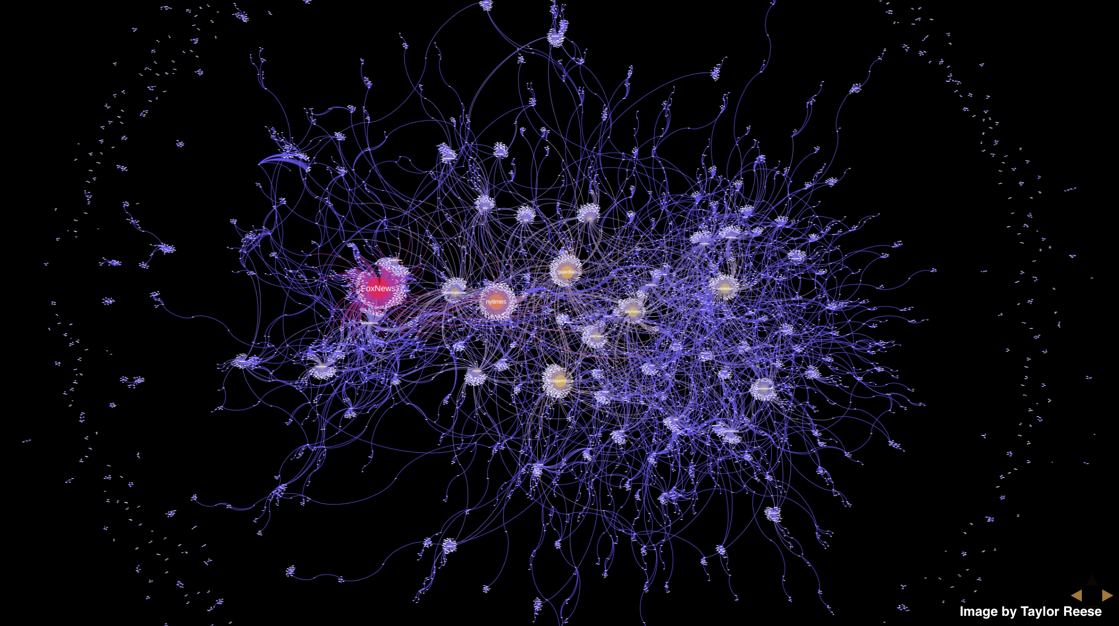
Martin from School of Computer Science & Informatics, Cardiff University talked about the increasing interest in visualising human sciences data due the sheer volume collected. Such big data can be easily collected thanks to mobile apps and other devices that are part of the Internet of Things. The problem is, given the theme of the workshop: how best can we visualise such vast amounts of information? When we only have a few variables with a few dimensions, it is often superficially simple to visualise the data. But once things start becoming more complex, so does the task of finding an appropriate graphical depiction. Some visualisations, while beguiling, are useless at telling a coherent story, while others do an extremely good job. Martin gave examples which tell us even less than the data itself about the big picture. On the other hand, a very useful example of a big data visualisation was given as a slide, where an interactive animation allows a smooth and meaningful transition from and to various views of data collected from politicians’ interactions on Twitter.
Christina from Laboratoire de Sciences Cognitives et Psycholinguistique, Ecole Normale Supérieure talked about the scientific method in practise and in theory, drawing emphasis to the role visualisation plays: "visualisations are what readers remember". Bar plots are simply not appropriate when trying to visualise distributional data, especially when they are not “normally distributed”. This is because only “normally distributed” data is well-represented by its mean and variance. Christina went through some cases where bar plots hide either differences or similarities between datasets and then cycled through a few (although not all) suitable examples of alternatives. More information about why you should avoid bar plots is available at #Barbarplots Kickstarter Video.
The last speaker of the workshop, Andy from The Liverpool School of Tropical Medicine, reminded the audience that the goals of any visualisation are to attract, inform and motivate the reader. With those goals in mind, Andy highlighted a few tensions in visualisation; namely, that clarity about the message might be in conflict with exploring the visualised data. Original approaches might be desirable but it is also often useful as a fallback to tried and tested methods, and simplicity makes it difficult to also display uncertainty (picking up a point from the previous talk). Focusing then on world data—that is displaying information about countries and regions either on maps or in diagrams—Andy introduced various visualisation options. Many of those are possible with the R package rworldmap, which welcomes feedback and contributions.
Hands-on sessions
During the afternoon, the attendees had a one-hour introduction to visualisation in their chosen programming language: Python, R, Javascript, or MATLAB. Following the introduction, an hour of 'Bring Your Own Data' took place, where attendees could get tailored assistance.
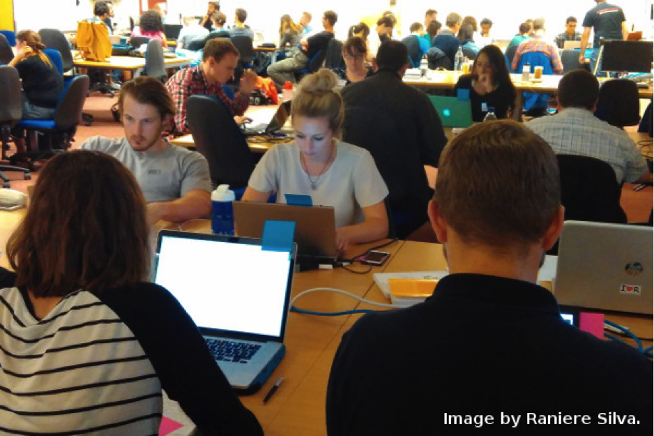
The specialists running the sessions were Dr Leighton Pritchard (Python), Dr Andy South (R), Dr Martin Chorley (Javascript) and Dr Alexandre Fioravante de Siqueira (MATLAB). Some used a system of red and green post-its to facilitate attendees when asking for help (please see photo above). This technique is also used in Software Carpentry and Data Carpentry workshops to help highlight members of a class that might need assistance. The Software Sustainability Institute is a big supporter of both efforts.
A big ‘Thank you!’
The Institute thanks the sponsors of the workshop, RStudio and University of Manchester for their funding and support, Prof Jessie Kennedy, Dr Martin Chorley, Dr Christina Bergmann, Dr Andy South, Dr Leighton Pritchard, Dr Alexandre Fioravante de Siqueira, those who attended and the steering committee.
Feedback Results
We had 50 attendees, including the speakers and three Software Sustainability Institute staff. The results below are based on 23 non-staff responses (46% response rate for non-staff who attended, an excellent response rate).
Overall, the workshop was a very enjoyable (4.2 out of 5 points on average) and useful (4 out of 5 points on average) experience for participants. 70% said they would recommend the event to a colleague. When asked why they would recommend the event, one of the attendees replied that the workshop "really helped me understand the importance of R and now I understand why my supervisor asked me to learn it".
41% said they would attend a follow-on workshop. One attendee said the hands-on session and more time for practicing would be their main motivation for attending a follow-on.
And there is more
Read all the best tweets at Storify.
Watch the talks and check the slides.